

©Pat Ashforth & Steve Plummer 2021
©Pat Ashforth & Steve Plummer 2021
ILLUSION LETTERING
|
To be viewed from below : |
One stitch wide : |
Lower case (shown above) Upper case |
|
|
Two stitches wide : |
Lower case (shown above) Upper case |
|
|
Small : |
Upper case |
|
|
Large: |
Upper case |
|
To be viewed from the side: |
One stitch wide : |
Lower case Upper case |
|
|
Two stitches wide : |
Lower case Upper case |
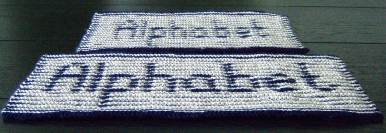
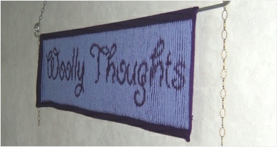
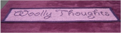
This is what you see when you look straight at the alphabets
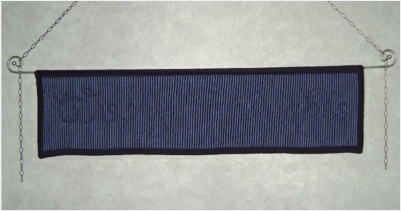
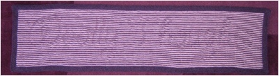
Below are examples of fancy lettering. They make large banners and cannot be any smaller without losing the curls in the letters. This alphabet is not included in the pattern.
Illusion lettering can be adapted for knitting in the round. Click for Gift of Life example.
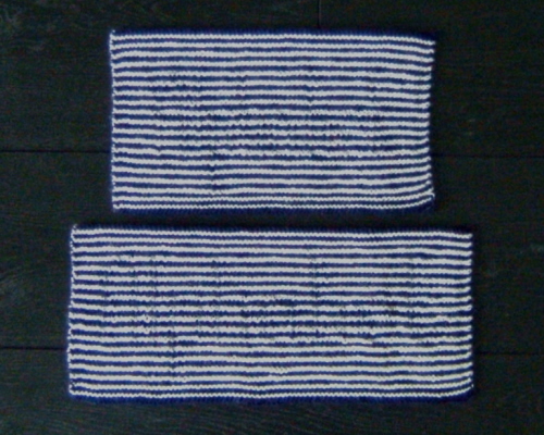
Illusion techniques work well for lettering. It is generally best to use simple letter shapes as fancy letters need much more detail and are inevitably rather large.
The alphabets shown above were knitted tightly using DK yarn and are approximately 5” (12.5 cm) high, including the uprights and downstrokes. The larger example (letters 2 stitches wide) is approximately 12” (30 cm) wide; the smaller one (letters 1 stitch wide) is approximately 9” (23 cm).
We have produced a booklet of charts for several plain alphabets and instructions for how to use them. Some are designed to be viewed from below; others are to be seen from the side.
| The Gift of Life |
| Merry Christmas |
| Drawing Programs |
| Using Inkscape |
| Modelling Programs |
| George Maffett's Introduction |
| Art tutorials |
| Geometric tutorials |
| Video tutorials |
| Maple Leaf |
| Tiger |
| Maple Leaf : Part 1 |
| Maple Leaf : Part 2 |
| Maple Leaf : Part 3 |
| Tiger : Part 1 |
| Tiger : Part 2 |
| Tiger : Part 3 |
| Tiger : Part 4 |
| Tiger : Part 5 |
| Tiger : Part 6 |
| Tiger : Part 7 |